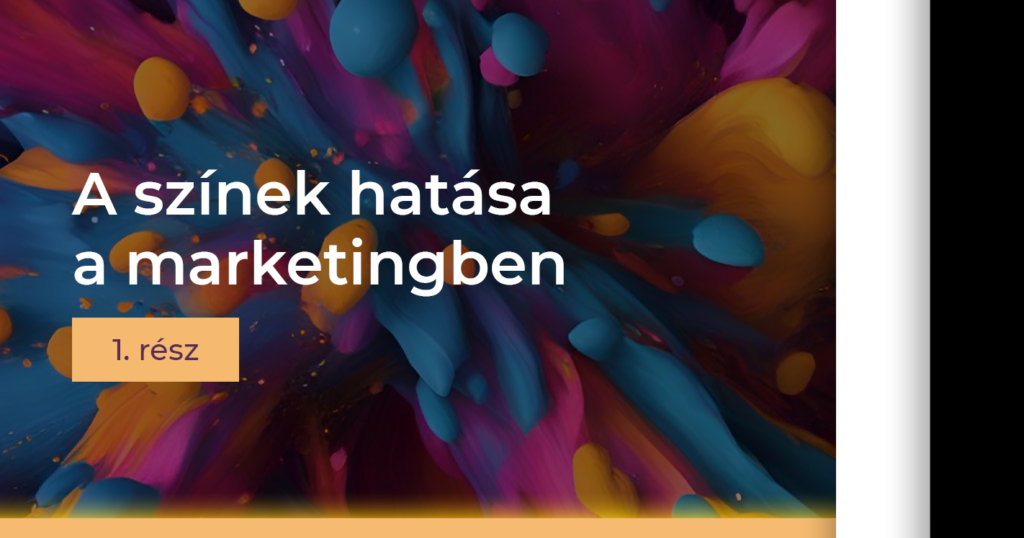
Colours influence our emotions, our choices and even our buying habits, as each shade evokes different associations. And these associations can be very varied. We can relate to them depending on the cultural background and the personal experiences. The impact of colour psychology in neuromarketing is such an exciting and important topic that we have dedicated a three-part blog series to it. Read the first part to learn more about shades of black and white.
The diverse world of colour psychology in the field of neuromarketing
Have you ever wondered how many colours there really are? Well, the answer is not simple, because the perception of colour is highly subjective. According to experts, it can range from a few thousand shades to a few million. The Pantone colour scale, which has been used in marketing and design since the 1960s, contains 2,100 colours. But! It is said that the wool dyers at Goblein were known for being able to distinguish 20,000 different shades of colour.
Of course, the perception of colour depends on a number of factors. Among other things, it depends on the material of the object being observed. The intensity of the light, the angle of refraction, the size of the object as well as the distance to the object all play a part. For example, colours with a larger surface area are perceived as more intense. However, the question still remains: when to use which colours?
Let’s look at two of the most commonly used shades. This way we can shed light on the relationship between colour psychology and neuromarketing.
Luxury shades in neuromarketing according to colour psychology: black
Black is a symbol of strength, mystery and elegance. It is often used in marketing to illustrate luxury, power and modernity.
Take technology products and car brands, for example. These companies often use black to convey a sense of innovation and quality. Apple, for example, has several products in black to give them an elegant look. And this also conveys modernity, according to the science of neuromarketing.
But there is also a black logo on Chanel, Sony, L’Oreal, Gucci, Bentley and Maserati. Even BMW has a black logo alongside the blue one. These global brands all want to emphasise a message of dominance or luxury. While this dark hue is the colour of eternal elegance and style in the fashion industry, it is understandable that it is also particularly popular among luxury brands.
However, it is important to note that it is also the colour that is associated with death in Western culture. Thus, based on colour psychology, if you use black more than necessary, even in online marketing, you can trigger negative emotions. Fear or sadness for example. If you use it on too large an area of your website, it can become boring and make it difficult to read online. It can create a gloomy and depressing mood that will put customers off. So always try to strike a balance when using black!

White: the sweet and innocent shade according to colour psychology and neuromarketing
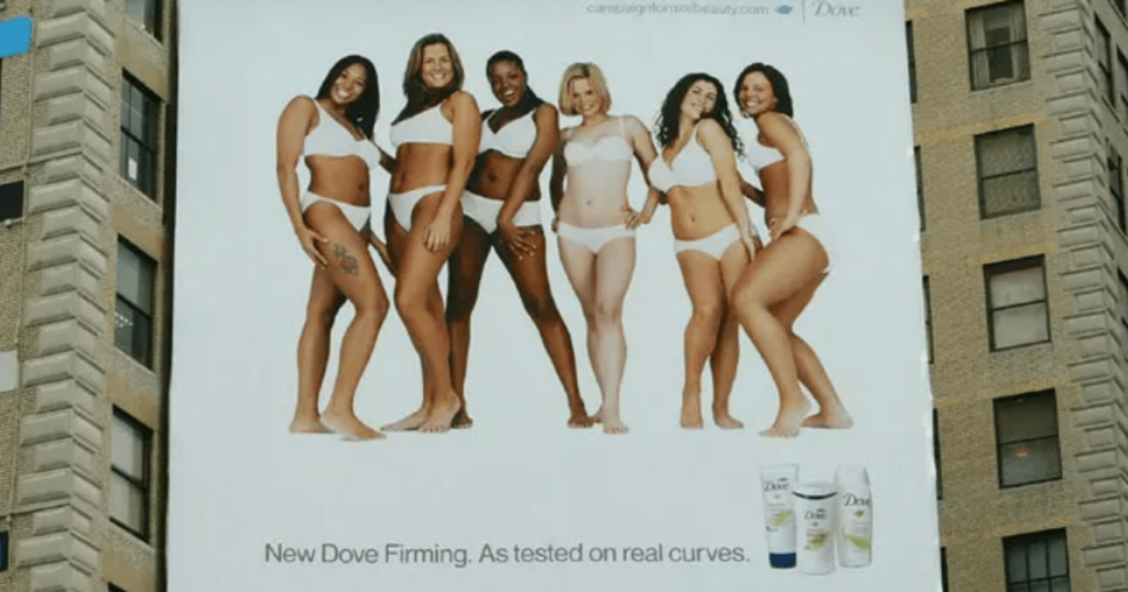
The colour of purity, simplicity and innocence. Websites and product packaging with a white background convey a sense of calm and orderliness that can calm users’ minds. In the neuromarketing of health products, medical services and cleaning products, it is a symbol of hygiene and cleanliness. Think of brands such as Colgate or Dove, where white is the dominant colour, emphasising the cleansing and caring properties of the products.
And if we are talking about logos, the issue of white is even more interesting in terms of colour psychology and neuromarketing. There isn’t really any branding that is white by default, but almost every logo has a version in this colour, as it’s easy to fit almost anywhere. Whatever logo, product packaging or website you look at; you’re almost certain to find a lot of white in it. And in online marketing agency practice, white comes up regularly.
As it’s a very neutral colour, I’d recommend using it more as a complement. It also highlights or offsets the overall effect. And neuromarketing guidelines say that if you pair white with blue, for example, your product will convey a sense of calm and reliability, while pairing white with green will convey freshness and naturalness.
However, overuse of white can create a very sterile and cold effect. This is especially important to consider if you want to convey a warm and welcoming image of your brand. A well-designed, white design can win the trust of customers with its dominant look, but if you overdo it, you’ll achieve the opposite.
Colour pshychology should be part of your neuromarketing efforts
If you are curious to know more about the interesting aspects of colour psychology from a neuromarketing perspective, stay tuned! In the next section, we’ll explain why blue is widely used in the B2B sector, why green is calming, and why many fast food restaurants use red.
If you want to dive into the details, listen to this episode of the Marketing Msc Podcast!
If you’re stuck or feel that online marketing is too big for you, contact us with confidence! Follow us on Instagram, Facebook orLinkedIn,where we share daily content on relevant topics. You can also find all our other content on Youtube.