Making social media posts is not always a piece of cake. Sometimes inspiration comes easy, sometimes not so much. Don’t give up, instead always strive to produce good quality content because it’s worth it. We give you 6+1 design ideas to make your Facebook and Instagram posts even better. Or at the very least to help you ask better questions to your digital marketing agency.
I won’t go into more detail about why you should put a strong emphasis on the appearance of your social media (Facebook, Instagram) posts, in addition to their relevant information content, but for the sake of order, here are some facts to remind you:
- our brain processes visual information 60,000 times faster than textual information
- users can recall the content of a message associated with a relevant image for up to 3 days longer,
- photo posts can generate up to 150% more shares and 2.3 times more engagement,
- bonus: infographics have also increased significantly in popularity in B2B marketing.
You might already know all of these facts and for sure your digital marketing agency knows them. However, do you think you’re taking them all into account when creating your social content? Are you sure you understand the most basic aspects of creating eye-catching, beautiful and effective visual content?
Define your goals for each post
First of all, of course, you need to define your goals
for each post. What do I want to achieve with this?
- I want to increase traffic,
- Conversions (purchases, subscriptions, etc.),
- Promote my status as an expert,
- I want to increase the engagement of my followers.
Yes, we know: conversion is at the top of your list of needs, but believe me, all the other additional goals are ultimately there to achieve it. The more diverse your toolkit, or that of your digital marketing agency, the more effective the process itself will be in the long run.
Of course, you also need to know your target audience (who they are, what platform they use, whether they prefer to browse the web on desktop or mobile, who they follow, how they are addressed, what other habits they have, etc.), but let’s move on to the design aspects.
How to make your social media posts better?
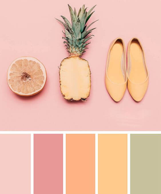
1. Use colours wisely!
Don’t be afraid to use colour! Even if you already have your own colours, it’s worth experimenting with additional shades that can be combined with them, and if you don’t have any, it’s time you did. ? There are plenty of online tools to help you make sure you find the best colour combinations for your posts, and you can also ask your digital marketing agency for a design change.
Don’t forget to always use RGB colours for your social media posts and other online graphics.
2. Don’t clutter the social media posts with text!
We know you put your heart into your business, service or product and you want to spread the word about it. But be careful not to live out that desire in the posts, and never instruct your digital marketing agency to do so either. If you put too much text on the picture, your audience will feel that you want to flood them with a huge amount of unsolicited information. To avoid overcrowding your designs, try to keep your message to 1, maximum 2 lines.
One of the most basic rules is to try to get your message across to your followers as simply as possible. That’s why it’s important to make the text as easy to read as possible, which also depends on the font style you use, the font size you choose and the colours you use (e.g. a contrasting font/background colour combination is almost always a must). This simplicity is a good way to measure how good your digital marketing agency really is.
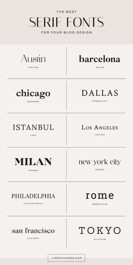
3. Playing with letters
Suppose you already have an established set of fonts that you like to work with, as in point 2. What could you do to spice up your postcreative? Start playing with letters!
- Have 2, up to 3 font families (typefaces) whose fonts look good in combination (if you’re not sure, the internet has some incredibly imaginative tools to help you choose) and use them. High contrast fonts work best (e.g. pedestal + pedestalless, etc.).
- Experiment with the size, colour, spacing and line spacing of the letters in a text box, but be careful with distortion.
4. Visibility, legibility – contrast in social media posts
Contrasts simply attract the eye, and this can be exploited not only by contrasting colour but also size and layout in an image. So try to place the logo in a more homogeneous area of the image. If this is not the case, use coloured shapes underneath, in the same way as you would under text. This will give you excellent legibility and make your brand easily identifiable (also) by the designs in your social posts.
5. Visual permanence, brand recognition in online marketing
It is said that, in general, you need to encounter a message at least seven times in the online space to recognise it later. If you’ve taken all 4 of our tips, the next goal is to ensure that over time, the social media creative you create or the digital marketing agency create for you, is clearly associated with you, your product or business. Not just because of the logo you put on it. By using your logo, colours and typography consistently, you’re sure to achieve this.
6. Be creative or contract a creative online marketing agency!
Believe it or not, creativity is in everyone, and with the right techniques and practice, you can bring out the best ideas in anyone – including graphic design. Try to diversify the design of your graphics and the subject matter of your posts. Establish a weekly pattern, have recurring themes combined with recognisable visuals. Experiment as much as you like, then at the end of the month evaluate which posts worked best or let your marketing agency do this for you.
+ 1. Make eye-catching creatives!
Remember, functionality is important, but don’t sacrifice aesthetics for it. What do I mean by that? For example, don’t cram your image with as much information as possible (event dates, descriptions, call words, badges, logos and even CTA? Of course…), keep simplicity and beauty in mind with a healthy balance of information to communicate. Don’t worry, anything that doesn’t fit in the picture, feel free to include in the post text.
We hope that we have inspired you to examine your content creation habits, and that you will take our advice to continue this extremely creative work with renewed vigour and enthusiasm.
If you’re still unsure and feel like giving content marketing a try with a professional team, don’t hesitate to contact us!